When running for a political office, there is a lot to think about when it comes to the brand and design of your campaign. It can require yard signs, buttons, billboards, print materials, TV ads, social media ads and the list goes on. It can be overwhelming but it’s important to understand the value of creating a brand that the voting public can relate and connect to. In turn, this will increase your name recognition, favorability and likelihood of support.
The growth of the internet and social media has changed the way people react to information. Our attention spans have become increasingly shorter, making it difficult to create a lasting impression. How do we make your social content and branded material more appealing and eye-catching in a short amount of time?
Here are a few tips on how to make a lasting impression through your design.
Stand out
Majority of people probably don’t care about your campaign like you do. It’s a tough pill to swallow, but most people see your Facebook post and keep scrolling, get a mailer and throw it away, or see a billboard or TV ad and immediately forget about them.
In order to stand out, you need to design for maximum impact. Make it easy for people to remember your name and the office you are running for. This can be done by using bold fonts and colors throughout your design and it doesn’t hurt to have good photography, too. Doing these three things effectively will set you apart from other candidates.
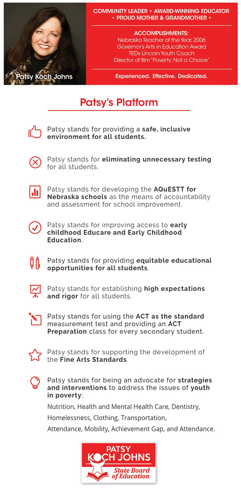
When working on the Patsy Koch Johns campaign, we used a powerful, bright red color. It was not hard for her graphics to stand out. Take this graphic for example: Patsy’s team provided us with a great photo of Patsy and Jim to use for their canvassing event. We used fonts and colors that matched Patsy’s logo and made sure the event information was large and easy to read. The stacked red boxes in the title was something we incorporated in many of her graphics throughout the campaign (which kept the design consistent).

Keep it simple
You stand for a broad range of issues, but you want something that completely encompasses who you are down to its simplest, purest form. You don’t need anything flashy to get your name out there.
Make sure your name, the office you’re running for and the campaign message is featured front and center on your materials. It’s also important to ensure this information is easy to read — with bold headlines, photos and a decent amount of whitespace. Smart choices of font, color, and simple graphical elements can also make a huge difference in the way your candidate is perceived.

Be consistent
Great design is key, but keeping that great design consistent throughout all of your materials is just as important. Throughout election season, people will start to notice and remember your campaign based on its design. They’ll recognize you by your logo, color scheme, graphics, and fonts. Pick design elements you want to use throughout your campaign that will keep you consistent.
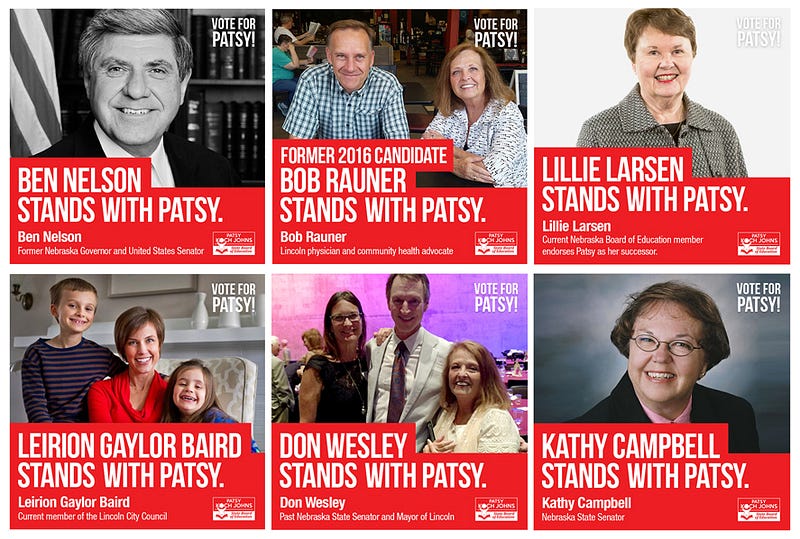
For example, when Patsy wanted to announce an endorsement, these stacked red boxes with large text were always used. If you saw this scrolling through your newsfeed, wouldn’t you do a double take?

Overall, designing for a political campaign can be simple, if you stick with it. Don’t forget to use these tips to keep your audience engaged and informed throughout the campaign. If you would like to see more of our work, check out our portfolio.